ID3AS Blog
What Is Your Type?

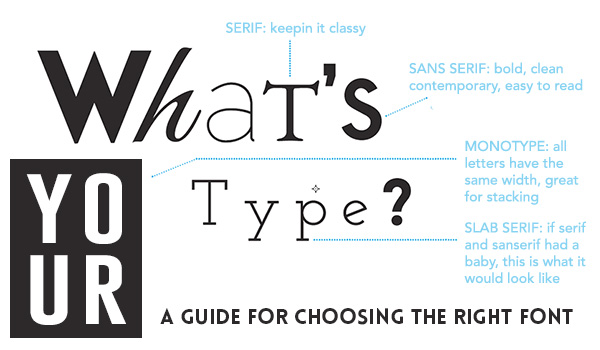
With the virtually unlimited selections of type available today, choosing a font can quickly send you down the rabbit hole. Should I choose a font that works in web and print applications? Serif or sans serif? What is a serif? What about a handwritten looking font? How many fonts do I need? Thin, regular, medium, bold, black, italic, oblique...the choices are endless. The experts here at D3 have created a quick reference guide to help select the type with the perfect fit.
Choose a Font That Fits
It is important to choose a font that fits the personality and identity of your business. It is easy to be swayed by the pressures of trends, but trends die quickly and so may your brand if you choose a font based solely because it looked great on that craft beer label or graphic tee shirt that you saw recently. If your brand is serious, try a serious font. You may want to consider something with a serif. Serifs are the “feet” at the tops and bottoms of letters originally seen in books. The serifs guide the readers eye, making it easier to follow large paragraphs.
These fonts are well established and can range from serious to fashionable depending on the weight, style and spacing. However, serif typefaces use varying stroke widths and are harder to read on monitors. It is a good rule to use only in headings on the web applications. Sans serif fonts like the one used here, are a good choice for paragraph text on any website. There are many fonts that are not available for web use. A quick search online and you will be able to find a database of web-friendly fonts.


Script Fonts
Script fonts are the most dangerous and tempting of all fonts. They lure you in with their fancy curves and embellishments but they are often difficult to read. There are two rules that should always be followed when using script fonts; never use as paragraph text, or in all capitals. Only use scripts and hand lettering as header text, whether in print or web.
Also, carefully consider the letters being used. It is easy to spell one word and have it read something completely different when certain letters sit next to others. These font can range from classical and distinguished to hipster and resemble hand lettered signage of past decades.


How Many?
The general rule for how many fonts you should use is no more than 3. This includes styling of type, such as bold, black, italic. After choosing the font or fonts, organize your type from “most noticeable” to “least noticeable”. It is ok to have your headlines and titles use a font that is thin and not bold.
Other factors such as size and color can make a thin font more noticeable than a bold one.
Successful typography, like with design, usually demonstrates restraint. Keep your choices simple and you will be on your way to implementing fonts into your brand that help establish a proper identity.

