ID3AS Blog
The Importance of Text Hierarchy and Typography

How we perceive the value of a product can largely be attributed to design. Effectively organizing content within a design, so that it’s easy to understand, and good for user experience is one of the most important roles of a designer. Since much of the content that designers work with is text-based, effective typography and text hierarchy are one of the most important aspects within a design.
Let’s break it down. The typography is the visual design of the text, and text hierarchy within a design shows the reader which information to focus on, which information is most important, and where the supporting information lies. It’s always important to consult with a designer who can help you consider all of your options.
Understanding Typography
Similar to how colors can evoke emotional responses, a font can do this as well.. Typography assists in making your brand’s first-impression; your font choices can influence your audience’s imaginations, moods, and expectations when they view your content. The typeface for your brand is extremely expressive, so it’s important that you make the right choice to convey your brand’s message.
While the importance of typography is often overlooked, it plays a critical role in strengthening your brand and creating interest in your products or services. Typography is about much more than making words legible. Your choice of typeface, and how it works with your layout, grid, color scheme, and so on, will make the difference between a good, bad, and great design. Typography is more than the design of letters and characters. It’s the point size, line length, and spacing, not just on a single line, but throughout the entire work.
Typography is everywhere, and every font, letter, and character arrangement plays a vital part in determining how a message is conveyed. Even the smallest adjustments can impact the look and feel of your work. In typography, the little details make the largest impact.
Serif and sans-serif fonts are the most legible and used for large amounts of copy text. Serif fonts have little embellishments that give the font a more structured, classic feel, while sans-serif is more contemporary, simple, and more readable.
Image Source: Canva
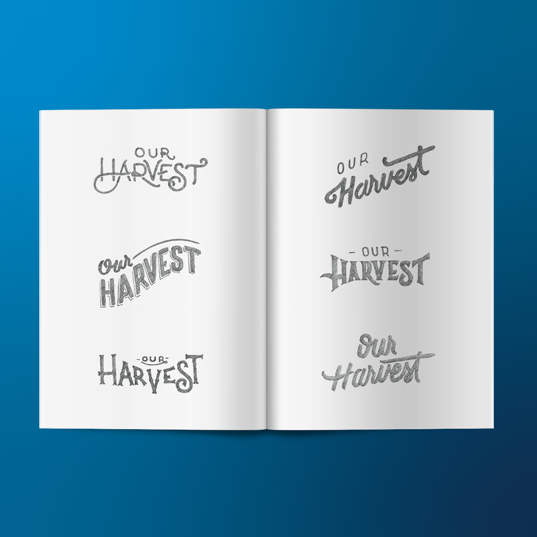
Display fonts and script fonts should be used for either title or headers, to make something stand out, and overall, should be used for shorter amounts of text. Typically, you will also see script fonts used in more eloquent, formal instances, such as wedding invitations or brochures.
Image Source: D3Corp Instagram
Typography is a big part of your branding. The elements that you choose to represent your brand, such as your logo, and colors, along with the type, can create a unique experience that will differentiate your brand from others.
Text Hierarchy
One of the most important techniques used to effectively communicate content is text hierarchy. Text hierarchy establishes an order of importance and allows the reader to easily find what they are looking for. Hierarchy can be established in a multitude of ways, including size, weight, color, position, and type contract. These methods are often used in combination with each other, and the combinations are endless.
When certain words stand out more than others you can use different weights (bold, regular, light), styles (italic), and sizes to create a sense of order within your text. This creates a legible flow and helps the reader to see what the most important points are. With an effective hierarchy, the reader will be able to jump from one section to the next to identify the most important points.
Text Hierarchy and SEO
Similar to how people scan text in a certain way with their eyes, so does Google, but with its algorithms. Setting your articles and webpages up with a clear structure has positive effects on your Google ranking. The way that your site is organized and your text is structured will pave the way for SEO success. Web crawlers, such as Googlebot, will crawl a website’s structure, their goal being to index the content in order to return it in search results. The better your structure, the easier the crawlers can access and index the content. Text hierarchy should be logical, and the keywords that you want your site to show up on Google and rank for should be level-one content.
Picture a newspaper with a headline, subheadline, and body copy, this is a classic example of the three levels of typographic hierarchy that are still used today. For a modern example, consider this blog! Combining all three levels of typographic hierarchy for an easy read.
-
Generally, your level-one will be the most important content or information, the most immediately visible typographic element in your design.
-
Level-two elements usually help organize your design into a section or group, with related information. This should not stand out as much as your level-one type. These elements should direct viewers to different parts of the design and help them navigate with ease.
-
Level-three typography is generally the meat of the design. This is where copywriting lives. The fonts chosen for this level need to be easy to read since the font size will likely be somewhat small.
For more information, please contact D3 at 410-213-2400, or email us at solutions@d3corp.com

