ID3AS Blog
Color: The Ultimate Statement

When it comes to print design, you may have found yourself wondering, what is a way to really make your design stand out and catch someone's eye? The first thing that comes to our mind is color!
Color is everywhere and without it, frankly, life would be boring! Color is what can help your design stand apart from the others!
Choosing Your Color Scheme
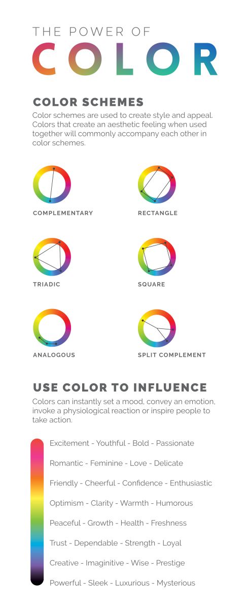
When deciding which colors to use, it’s important to go back to the basics of the good old color wheel. Colors have a way of creating style and appeal. If you are seeking to achieve harmony, it can be accomplished through many different color schemes. You have endless options as to which scheme you choose to use. Are you ready to become a color scheme expert?!
Complementary colors are those directly across from one another on the color wheel...red and green, blue and orange, and purple and yellow. These colors will stand out and have a high contrast. A rectangle scheme (also known as tetradic) consists of four colors, made up of two pairs of complementary colors. The balance between warm and cool colors in this scheme is important and a single color should really stand out.
A triad color scheme consists of colors that are evenly spread on the color wheel. This type of color scheme is typically quite vibrant. A square color scheme is a scheme with all four colors evenly spaced around the color wheel. One color should dominate the others and achieving a balance between warm and cool colors is important in a square scheme. When colors are all directly next to one another, that is a analogous color scheme. This scheme tends to be pleasing to the eye and give a serene feeling. Lastly, a split complementary color scheme uses a base color and both of the colors adjacent to its complement. This color scheme has less tension than a complementary color scheme, but still strong contrast.
When choosing your color scheme, you also need to determine what type of influence you want to have. Color can make people feel a wide array of things emotions all the way from peace to utter excitement. It can also create a mood or feeling which can, in turn, motivate others to take action. So be sure to ask yourself, what exactly do I want my color scheme to achieve?
Not only does color choice create style and appeal, but it can establish a mood, express an emotion, or cause a reaction. Color has been shown to inform, engage, increase memory, and studies have even shown that color can improve your brand recognition by up to 80%. Color is important to your design and can do just about anything!