ID3AS Blog
Choosing a Color Scheme for Your Brand

When considering your branding, you’ll want to cultivate a strong emotional connection with your audience. How a customer feels about a brand, has more pull than they realize. Choosing colors that provide a shortcut to the hearts of your clientele can evoke emotion, and convey your company’s story. Emotions are powerful, and often, drive our decision making.
The proven psychological effects of branding colors are deafening. We’re no longer asking do brand colors work? But instead, how do I make brand colors work for my company? This is why the D3 design team has created a guide for what you need to be aware of when choosing colors for your brand.
Application of Brand Colors
The colors you choose to represent your brand have the ability to impact your sales and performance. Moreover, the repetition of the same colors in all of your business ventures strengthens your brand’s association with those colors and strengthens brand awareness as a whole.
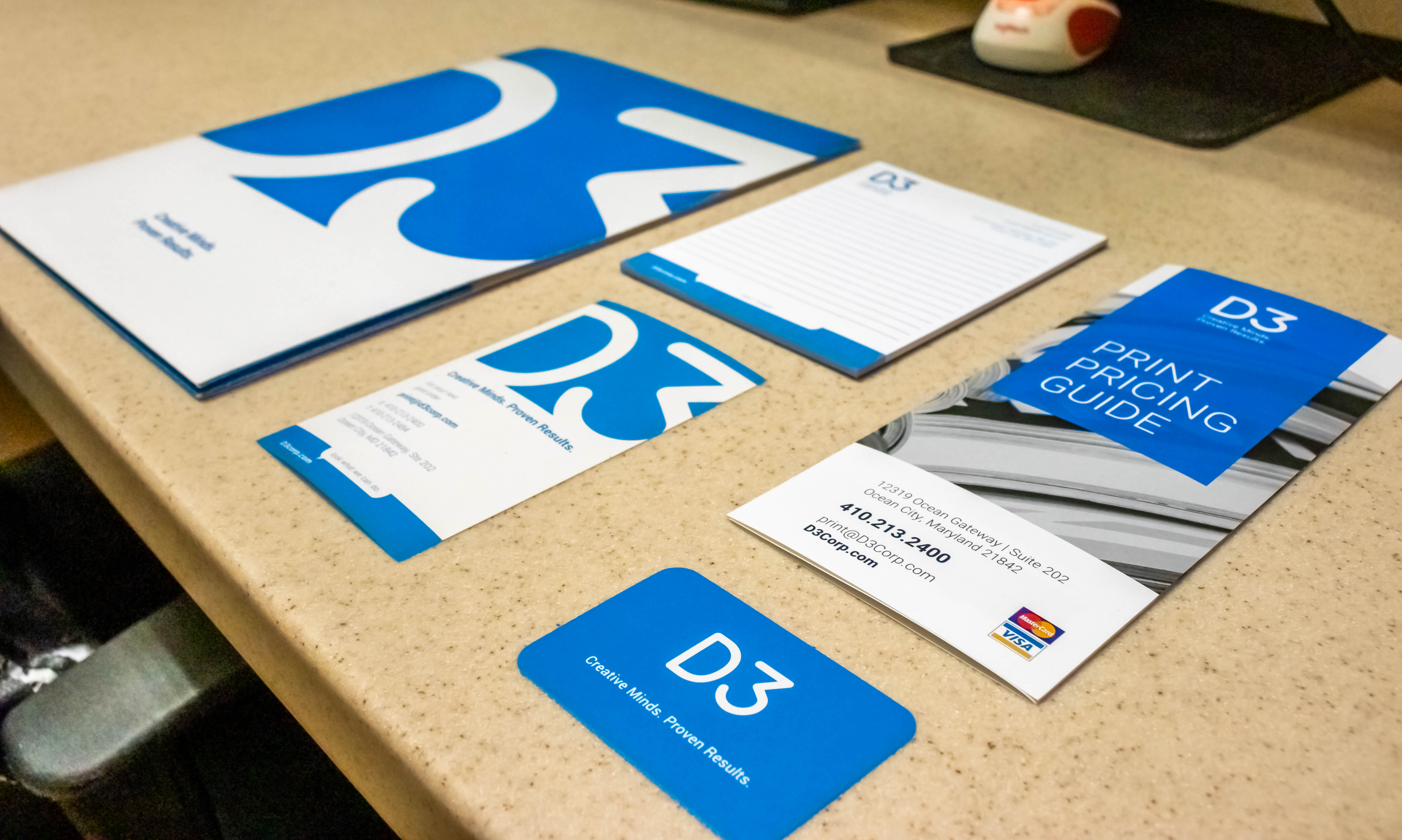
The most common areas where you’ll use your brand colors will be your; logo, website, storefront, in-store design, staff uniforms, advertisements, and social media, just to name a few. This is why it’s so important to carefully choose your branding colors, as they will have a direct influence on your brand’s identity.
When someone says Home Depot, what color comes to mind? Orange! What about Target? Red! It’s not just because you find those colors in the logos, but rather throughout their entire shopping experience right down to the shopping carts and aisle markers.
In addition, the use of colors ultimately impacts the user experience in a practical way that is not rooted in the psychology of color theory. Choosing a color affects a product or website users’ experience because it can make or break a design being accessible to users.
Choosing Your Brand Identity
Before you can decide what colors you want to represent your brand, you must decide on your ideal brand personality. Is your brand playful or serious? Loud or subdued? Modern or classic? Are your products geared towards children or adults, and how will the colors you’ve chosen affect them cognitively? When you know what you’re trying to communicate, choosing your branding is easy.
Think: If your company were a person, who would they be? What would they like to do? What would be important to them? Once you’ve established this, then you can choose your branding colors
Once you decide on your brand identity, it’s critical to consult with a designer before moving forward in choosing the colors to represent your brand. Designers use color theory to develop unique color palettes for clients every day. From choosing warm colors over cool tones, or devising a set of tints and shades to use across your company’s print and web. A designer will help to create the perfect palette, designed to sell your product or service, improve user experience, and help a company stand out.
What do Branding Colors Mean?
The effect of your branding colors will depend on the style and design that they are used in, as well as the color combinations that are chosen. This list is an abridged version, and it’s important to remember that our psychological associations and connections to color can reach a lot deeper than this. For example, while yellow evokes happiness and optimism, too much yellow can cause anxiety. It’s important to note that color theory goes across the board in regards to design, and is not solely specific to branding. To be sure that you are choosing colors that represent your brand, we always suggest consulting with a designer.
Color Theory
Red: Stands for passion, excitement, and alertness. It can signify importance and command attention.
Orange: Stands for playfulness, vitality, and friendliness, it’s invigorating and evokes energy.
Yellow: Evokes happiness, youth, and optimism, but can also seem attention-grabbing or affordable.
Green: Evokes stability, prosperity, growth and a connection to nature.
Light Blue: Exudes tranquility, trust, openness, and can also signify innocence.
Dark Blue: Stands for professionalism, security, and formality, it’s mature and trustworthy.
Purple: Signifies royalty, creativity, and luxury.
Pink: Stands for femininity, youth, and innocence, it ranges from modern to luxurious.
Brown: Creates a rugged, earthy, vintage look or mood.
White: Evokes cleanliness, virtue, health or simplicity, it can range from affordable to high-end.
Gray: Stands for neutrality, it can look subdued, classic, serious, mysterious or mature.
Black: Evokes a powerful, sophisticated, edgy, luxurious and modern feeling.
For more information, please contact D3 at 410-213-2400, or email us at solutions@d3corp.com